Here are three more, along with a bonus fourth, all with a theme of exponential growth – the powerful force that is behind much of the concern about climate change and many other environmental and social challenges. Figures like these are increasingly called “hockey stick” curves, after the work of Professor Michael Mann and others in the climate community, but such rapid exponential changes, which often signify problems (unless your bank balance looks like this) are common in other scientific fields as well.
First: a root of the problem. Global population. Figure 1 shows the world’s population from 1300 to the modern era. Today’s population exceeds 7 billion.
Figure 2 from the 2013 US national climate assessment shows two thousand years of atmospheric concentrations for carbon dioxide, methane, and nitrous oxide: three of the most important and dangerous greenhouse gases.
Figure 3 shows over 10,000 years of carbon dioxide concentrations with measurements taken from ice cores (and a clear discussion at the website of Skeptical Science), and most recently from the Mauna Loa station (those instrumental data were shown, in more detail, in my April 2ndpost).
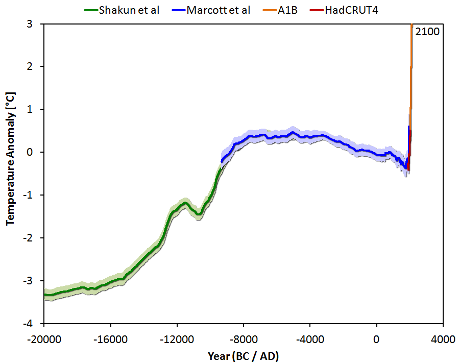
Figure 4 is a clear, albeit disturbing graph that includes recent key findings on ancient temperatures reconstructed by the paleoclimate community for the past 20,000 years, plus the most recent instrumental record, plus projections from state-of-the-art climate models, showing how the world is racing into uncharted waters.
More “significant figures” to come.

Figure 1. Global population over the past 800 or so years. Today’s population is over 7 billion, and growing.

Figure 2. 2000 years of atmospheric concentrations of major greenhouse gases (CO2, methane, nitrous oxide), from http://www.globalchange.gov/HighResImages/1-Global-pg-14.jpg.

Figure 3. 10,000 years of atmospheric carbon dioxide concentrations from paleoclimatic records, and recent observations. http://www.skepticalscience.com/co2-measurements-uncertainty.htm

Figure 4. 20,000 years of global estimated temperature, from paleoclimate reconstructions, recent observations, and model projections. http://tamino.wordpress.com/2013/03/22/global-temperature-change-the-big-picture/.